Boar’s Room
Identity crest: Covington, KY. Engraved boar’s head, ribbon, and a formal double-rule frame.
Art Director · Cincinnati, Ohio
An art director who listens first. Design, illustration, photography, and sound, each one feeding the next.
Vinnie works across all four: brand identities for local businesses, character illustration in ink, landscape photography shot on the road, and sound for picture. He holds a BFA in Sound Design from SCAD, which is where the listening comes from.
Enter the portfolio
An art director who listens first. Design, illustration, photography, and sound, each one feeding the next.
Vinnie Palopoli is a multidisciplinary art director based in Cincinnati. The work moves between brand systems, character illustration, landscape photography, and sound for picture: different mediums, one standard: nothing ships until it looks, reads, and sounds intentional.

Identity and print on one side of the desk; sound for picture on the other. Both are design: one for the eye, one for the ear.

The Soundwave: thin concentric Ink rings radiating on Cream, the system’s one approved patterned ground.

A full identity rebrand for an Atlanta audio production company: location sound, post, sound design, foley, composition, and sonic branding.
Sounds Good sells an invisible product: how things sound. The company needed an identity a client could hold onto, something that reads instantly on a call sheet, a business card, or a festival credit, and still feels like a working sound company, not a tech startup.
The line they work under: “you make stuff. we make stuff sound good.” The brand had to carry that same confidence.
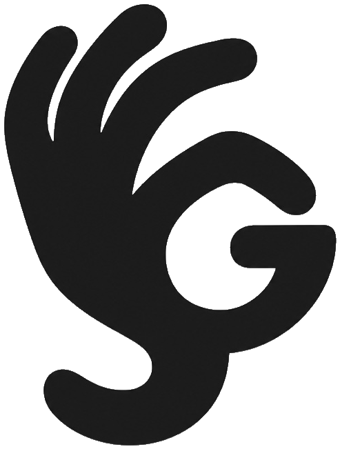
One gesture does all the work. The mark is a hand forming the OK sign, the universal “that’s perfect”, drawn so the same hand reads as two letters at once: the S of sounds in the fingers, the G of good in the palm.
No tagline needed. The logo is the review every client wants to give: perfect.
The final system: the wordmark sits on a single line, set in IBM Plex Mono SemiBold, the typeface from the company’s black business card, promoted to the brand’s main voice, tracked wide at +160, with the space between SOUNDS and GOOD closed down to about a third of an em: clearly two words, never joined.
SOUNDS GOOD
A complete kit, built to be used, not a logo in isolation.
The front stays clean, the wordmark and the two facts that close jobs. Everything else lives on the back, in cream on Harbor Navy.
Classic American full-size cargo van, short hood, black bumpers, steel wheels, one long flat side panel. Harbor Navy letters, one Tangerine hit: the phone number. Readable at 40 mph: the full wordmark big on the side panel like a real wrap, the secondary monogram on the front door, number big enough to dial from the next lane.
Harbor Navy sign, cream type, reads from the street and survives a Milford summer on corrugated plastic or aluminum.
Harbor Navy shirt, cream print, one color, any print shop in town can run it. The secondary monogram over the chest; the full wordmark works the back.
A complete rebrand for a Milford, Ohio painting company, full identity: logo, palette, typography, vehicle livery, print, and social, built on the promise printed on the old card and kept: Guaranteed Quality.
Marvin Lilly has painted houses around Milford for over 25 years, interior, exterior, and custom work, fully insured, every job guaranteed. The work had a reputation; the company had no identity to match it. He needed one system that could run from a business card to the side of a van without losing the neighborly feel that wins him the jobs.
The name is the logo. MARVIN LILLY PAINTING is set in Poppins Bold, and the P in PAINTING is Marvin’s original paintbrush mark, handle, ferrule, and bristles, standing in for the letter itself. Four graduated Tangerine strokes sit tight at the bristle tips, like paint just laid off the brush, over the tagline: Guaranteed Quality.
Harbor Navy, warm Cream, and one Tangerine hit carry the palette; Poppins does the talking out loud and Nunito handles the everyday reading. Where the full name won’t fit, a social avatar, a shirt chest, the van door, a secondary MLP monogram takes over: the same brush P, strokes left off so it stays crisp at thumbnail size.
The full kit, ready to hand to the client, the printer, and the sign shop.
Film work: watch on YouTube
 Watch on YouTube
 Watch on YouTube
Compositions: press play
Original music written to picture, score that supports the scene instead of announcing itself.
Built soundscapes and designed effects: the layer of a film you feel before you notice it.
Cleaned, matched, and finished production dialog so every line lands the way it was performed.
Performed and recorded the everyday sounds a camera can't capture, footsteps, cloth, props, synced to the action on screen.
Identity crest: Covington, KY. Engraved boar’s head, ribbon, and a formal double-rule frame.
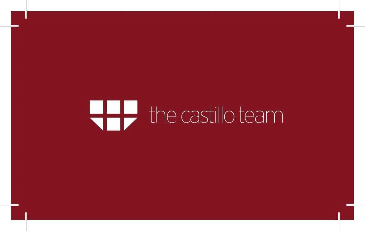
Business card, front, geometric mark set in thin-weight type on a deep red field.
Repeating pattern study, a single eye motif tiled into a surface design.
character work
landscape series
Vinnie Palopoli directs brands the way a good mix treats a song: every element in its place, nothing louder than it needs to be.
It starts in Savannah. He graduated from the Savannah College of Art and Design with a BFA in Sound Design, and that training is the root of everything here, not just the audio. Sound design is where he learned timing, tone, and restraint: how an audience feels a moment a beat before they understand it. And he didn’t stay in his own lane while he was there, he spent a good amount of his time at SCAD collaborating with advertising majors on their projects, cutting sound into campaigns and learning how a concept gets built across disciplines. That cross-disciplinary teamwork is part of the foundation: an art director who has sat on the other side of the brief directs differently. Years of work in audio since, composition, sound design, and dialog for picture, including the Sounds Good production company in Atlanta, sharpened that instinct. The same ear runs the visual work: identity systems, ink character illustration, and landscape photography shot across six ongoing series.
Since graduating he has freelanced, and freelanced on the move. A great deal of the years since SCAD have been spent traveling the world, deliberately stocking his eye and ear with other cultures: their music, their signage, their light, their noise. That is where the eye comes from. The photography series were shot on those roads, and the character work and brand systems carry what he picked up along them.
That range is the point. An art director who has mixed dialog hears how a headline lands; one who has drawn a character by hand knows when a logo is lying. He brings all of it to the table at once, and directs it as one body of work.
Brand identities, illustration, photography, and sound, directed as one piece of work. Start with the reel, or see the sound company in the wild.